
Why Bad Design Fails and What It Teaches Us
Most assume the best way to learn design is by studying iconic products.
As design students, we naturally gravitate towards success stories, analysing what makes them aesthetically pleasing, functional, and innovative. But some of the most valuable lessons in design don’t come from products that got everything right. They come from ones that didn’t.
Failure has a unique way of exposing what good design often hides. When a product works well, we barely notice it. We instinctively know how to use it, it fits naturally into our routine and it quietly does its job. On the other hand, bad design demands our attention. It almost interrupts our experience and creates frustration, making what should have been an effortless experience feel almost challenging. Ironically though, that’s what makes it such a powerful teacher.
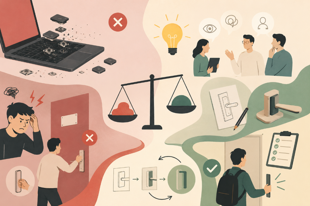
One of the most well-known examples include Apple's Butterfly Keyboard. Introduced in 2015, Apple set out to create a keyboard that would allow Macbooks to become thinner and sleeker than ever before. From an engineering perspective, it was an ambitious achievement. However, for many, the experience proved to be quite the opposite. Something as insignificant as a speck of dust caused the keys to stick, stop responding, or register multiple presses. A product designed for everyday use suddenly showed to be unreliable in everyday situations.
The Butterfly Keyboard wasn’t unsuccessful because it lacked innovation. If anything, it had too much of it. In pursuing a thinner, more elegant laptop, the design lost sight of the one quality users valued most, functionality.
It’s a reminder that innovation should never come at the expense of usability, sophisticated engineering means very little if the user is left feeling frustrated.
However, not every design failure is as high-profile. Some are so ordinary that we encounter them almost every day without giving them much thought.
Think about the last time you walked up to a door, reached for the handle, instinctively pulling, only to realize you were meant to push. It feels like a small mistake, but is it truly the user’s fault? More often than not, it’s the design that’s at fault.
A well-designed product communicates how it wants to be used, if someone needs a sign that says “PUSH,” then the design has already failed to communicate its purpose.
Moments like this reveal something fundamental about design, people shouldn’t have to stop and think about how to interact with everyday objects. The best designs feel intuitive because they align with human behaviour rather than expecting users to adapt.
This raises an interesting question, if companies with some of the world’s best designers can create products that miss the mark, why does this happen? The answer is rarely simple.
Every project is a balancing act between aesthetics, functionality, manufacturing constraints, cost and sustainability, and technological ambition. Sometimes one priority can quietly overshadow another. A product can be thinner, cheaper or more visually striking, but if those improvements make it harder to use, the design has lost sight of its purpose.
As students, it’s easy to believe that good design means producing something original, visually impressive, or technically advanced. But studying failure teaches us a different lesson. It encourages us to ask difficult questions, challenge our assumptions, and remember that we are not designing for ourselves.
The people using our products are bound to have different habits, expectations, and ways of thinking. The only possible way to understand the client is through observation, testing, and feedback.
Perhaps that’s what makes prototypes and mistakes such an important part of the design process. Every failed idea reveals something that success often conceals.
In the end, good design isn’t simply about making products that look beautiful, but rather about creating experiences that feel effortless. And sometimes, the clearest path to understanding that principle begins with something that didn’t work at all. Every ‘bad’ design reminds us that design isn’t measured by how impressive it appears, it is measured by how well it serves the user.